Artlogic Platform
Art + Tech
Details
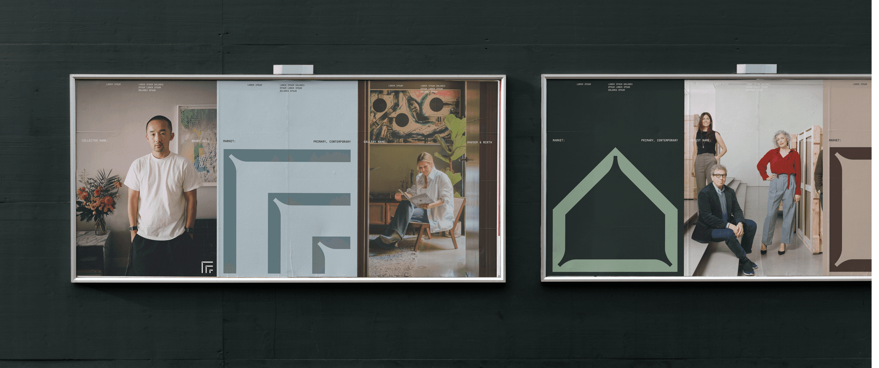
Technology isn't often associated with tactility, and this is a challenge that this design language seeks to overcome. With a minimalist approach that favours order, grids, and geometry, with a particular focus on typographic elements, negative space is harnessed to create a technology brand that has a commanding presence both physically and conceptually.
Services
Brand Identity
Website
Year
2024


Harking back to the past to sing to the future by drawing influence from the Bauhaus design movement, this visual language centres around art: the art of our clients, the art of our product, and the art of supreme design. Subtle and restrained colour palettes alongside systematic layouts bring a sense of refinement to the overall look and feel, whilst the understated elegance of the design work itself really allows the art we champion to sit centre stage.
This visual language prioritizes function over form, using negative space and minimal design to highlight information and imagery. Riso print treatment of imagery and ink trap typography add artistic flair, while color is used sparingly, appearing mainly in artworks and brand imagery.
Credits
Design
Hamish Whitworth as Head of Brand @ Artlogic
